How to Style Those Beautiful Built-In Shelves
Does your home feature a beautiful built-in shelf, but you’re not sure how to style it so that it’s swoon-worthy?
Plot twist: Your built-ins don’t have to only hold books. In fact, they stand out when they hold more than just books! After all, the built-in is meant to be one of the major focal points of the room, so don’t overlook the chance to let your inner interior designer shine!
Styling a built-in is part science, part art, but with these tips, you’ll be a shelf-styling master!
CREATE BALANCE.
If you have a built-in on either side of your fireplace or mantel, you need to create balance. But we don’t mean balance as in each side needs to reflect the other like a butterfly’s wings. We mean balance of visual weight.
For instance, eight massive objects on the left side of the built-in and a couple of tiny plants on the right side of the built-in offers uneven visual weight—and this is not aesthetically pleasing.
So how do you create visual weight?
If you have a large item on the left side, place a similar large item on the opposite shelf side. For example, if you have a large vase on one side of the shelf, include an item of equal proportion on the opposite shelf side, like a plant or another vase.
Balance is all about creating even visual weight on both sides of the built-ins.
Use odd numbers when placing items: A combination of 4 books and 1 vase set on top of the books will give you that odd number of 5 items on the shelf. Use this odd number rule throughout the entire shelf, whether it’s a group of framed photos from your family’s trip to the beach or an assortment of succulents from the Farmer’s Market.
CREATE MOVEMENT.
You want to create movement with the shelves, inviting the eye to follow the placement of items up and down the built-ins.
How can you create movement? By stacking books both vertically and horizontally around the shelf, or by layering objects to give the built-ins more depth, like putting a piece of art in the back of the shelf while placing a couple of smaller accent pieces in front.
Create movement by varying the height of items. Stick to the 3-tier system (tall, medium, small), but make sure the items connect either by color, style, or theme. (We don’t want the shelf to look like Dumbledore’s office of hodgepodge unidentifiable items in Harry Potter.)
Add depth to your shelf by layering objects.
Create interest by using odd number - see how I used 5 items!
GET CREATIVE.
But that doesn’t mean you shouldn’t get creative about bringing in your own personality!
Look for unusual items to add to your shelf, like the collection of glass pieces that you brought home with you from the glassblowing shop in Venice. Use items that are conversation-starters and personal to you.
ADD COLOR.
One way to add a pop of color is to paint the back wall of each shelf, or even to add wallpaper! If painting, stick with a color that coordinates with the flow of the room color and keep this color consistent with the backs of the entire shelf. With wallpaper, go for a print that isn’t too busy.
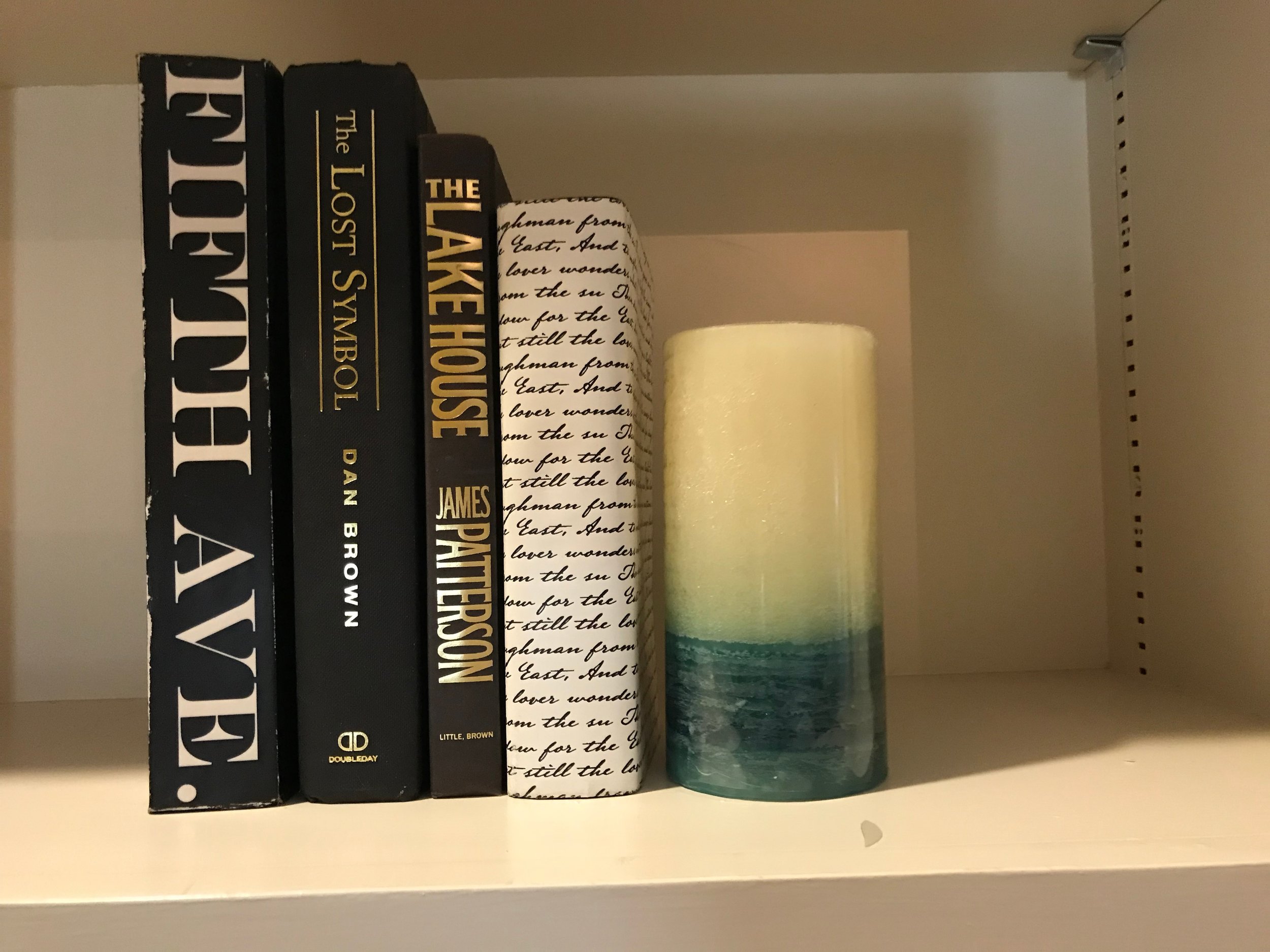
Remember to color coordinate: Use books in the same color palette as the room; for instance, if you have blue pillows, use books that have hues of blue in the binding.
If you have a library of books that you would like to store on your built-ins, but they don’t coordinate with the colors in your room, simply turn the books around so that you’re only seeing the pages rather than the bindings. A simple fix!
MAKE IT MULTI-USE.
Use baskets that fall into the same color palette as the room to store electronics, like remotes and phone chargers, that we usually have laying haphazardly on the sofa or coffee table. Voilà: a cute and subtle way to store your electronics!
GO GREEN.
Bring the built-ins to life (literally!): always include something from nature, like succulents, greenery, rocks, or seashells. Not only will bringing in plants liven up your built-ins, but they’ll also boost your mood—studies show that indoor plants can help us feel more relaxed. A beautiful built-in AND a mood boost? We’ll take it!
FINAL NOTES.
Keep smaller knick-knacks for other places in the home—a built-in is the platform to let the larger items shine. You want to be able to see every item on the shelf from the opposite side of the room.
And finally, you don’t want your shelves to be overloaded with items as though it is a crowded antique sellers stand. Leave space or breathing room to let your collectibles stand out!
As you are styling your built-ins, keep stepping back to get a wide view of the shelves. If it doesn’t please your eye, rearrange a few items until you are happy with the balance, movement, color, and creativity of the shelves. And most importantly, have fun with it!
ARE YOU A HOMEOWNER PREPARING YOUR HOME TO SELL?
How you stage your built-in shelves—and the rest of your home—can be the difference between 23 days on the market vs. 184 days on the market. Home staging works: properties that are staged prior to going on the market spend 73% less time on the market than properties that were not staged—let’s work together to get your home ready for listing!


